What is a landing page ?
A “landing page” is any kind of webpage which a consumer may land on, however from a marketing perspective, it is a page distinct from the homepage or some other page.
The landing page serves a focused or single purpose, it can be a follow up of any content that you have made earlier. The objective of a landing page is to take a step towards making a visitor your customer. The landing page lets you conduct some special offer, trade, deal or information, in return for contact information.
A landing page can be click-through which may lead to another page like, lead generation or e-commerce site. Lead generation pages basically offer free trials, webinar registration, contest entry or eBooks in return for contact information of the customer. A good landing page does its job by convincing any potential customer that it is worth it to give away their personal details in exchange for what you have to offer. A customer can find your landing page through organic search or through the company website, which increases the likelihood of the potential customer ending up there.
It is not necessary to have just one landing page, several marketing experts are of the view that one can maintain multiple landing pages targeting segmented potential customers and suggests businesses to do the same.
Landing Page vs. Website Homepage
Many people raise a common question, that is why should they bother to have landing pages when the main objective is to drive customers to the homepage. The answer to that is, while it is undoubtedly a good thing to get traffic to the homepage, the conversion rate is rather less than a landing page.
Home pages have a lot of information which invites the users to navigate them through a variety of different options and locations. But in case, your visitor is on the homepage with one single goal in their mind, there is a chance of them getting turned off if they have to go through various services and product options available.
The main objective of the home page is to direct users to the other pages, where they can find the information they are looking for. A landing page eliminates that intermediary step as it is the page that the user is wanting to visit.
The home page is general, on the other hand the landing page is specific and focused. While a homepage invites the visitor further into the website by showing all the options the business will offer, a landing page directs the visitor to a clear and simple call to action.

Why Use Landing Pages?
You have done a good job by building the brand and creating a website which represents it. Your next step is to make sure that all the hard work that you have put into the site translates into sales. As a marketer you must be looking for an effective lead conversion tool, a landing page is definitely something you must go.
Landing pages are a great way to drive in traffic, build the brand and improve your SEO. It can also be an effective part of a PPC strategy. Almost 68% of B2B businesses use a landing page for generating leads for any future conversion. However, 44% of the clicks are directed to the home page, which is not a great strategy (we will discuss). The purpose of landing pages is to direct the customers to a particular product, offer or service and encourage them to take an action. Hence, this is the opportunity to build a customer base and create conversions.
The question is if a landing page is so essential then why doesn’t every business use them? There is a common misconception that it is difficult to maintain and create one. The good news is that this isn’t true. Creating a landing page is a lot less about flashiness but more about providing the customer with what they want.
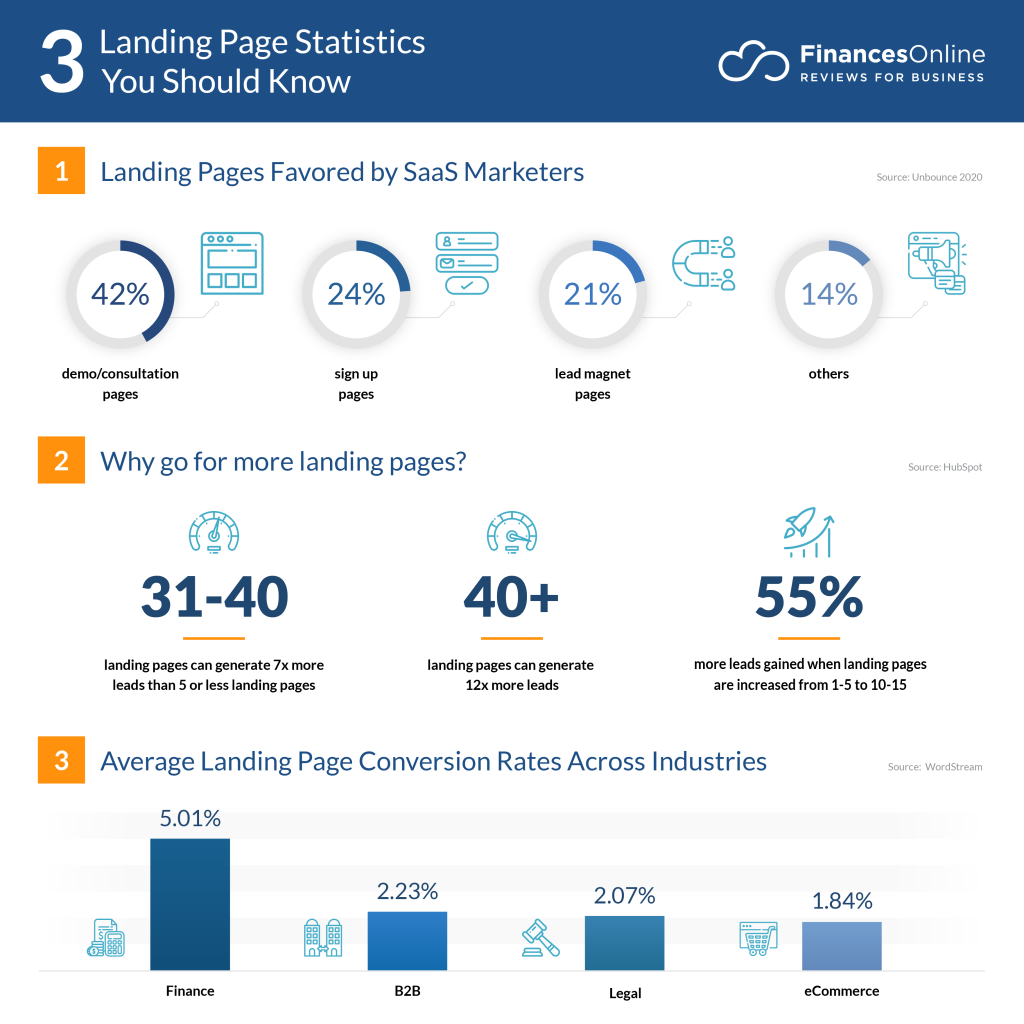
10 Ways to improve your landing page
1. Determine the goal for your landing page
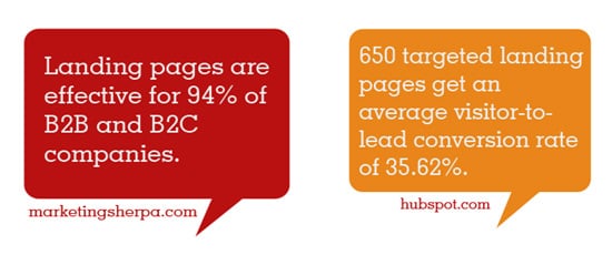
As per Toptal, a landing page exists to drive conversions. So, it is important that you know what type of conversion you are hoping to drive inl? One of the common conversion goals are:
- Building brand awareness: Brand awareness includes growing the email subscriber list and also building a relationship with the individuals through content about the brand and also the products or services that shall ultimately result in a trust and loyalty of the customers.
- Lead generation: This typically involves getting the contact details of visitors interested in the product/service so that a member of the sales team can follow up.
- Sales: The aim of sales is to facilitate fast purchases by showing a particular product and giving users the facility to buy or add to cart without leaving the landing page.
Determination of your goal is essential to your planning process, because it will influence the design of the landing page.

2. Planning the layout
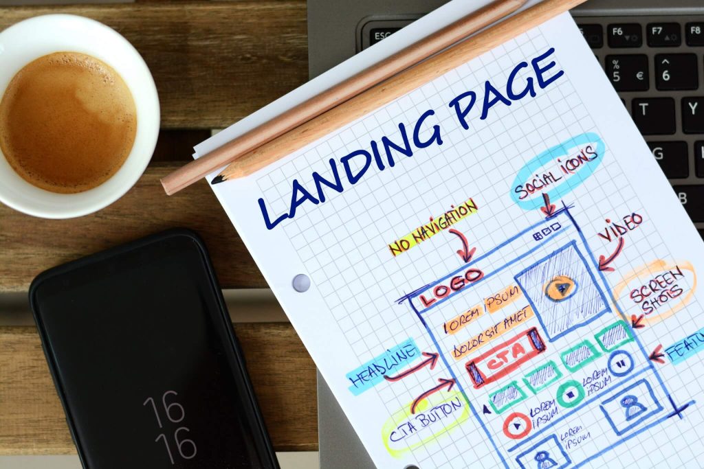
The goal of your landing page could be anything but it must have these following elements:
- A catchy headline
- A brief description of the offer
- Relevant images
- A lead-capture form
- A CTA
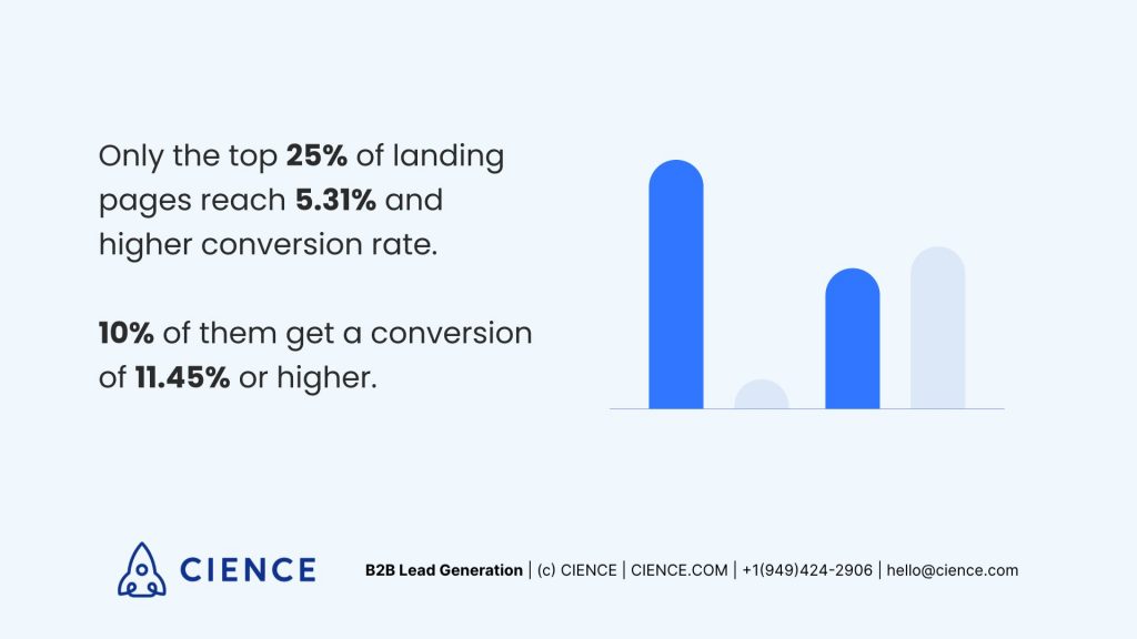
3. Try keeping the copy concise
Make sure the headline and description is short and concise, your focus should be on the message. This may seem to be easy but can be quite challenging, but remember it’s vital for the user experience.
A 2018 Microsoft study, Per Cision found out that the attention span of an average human is just 8 seconds. So the focus of the landing page should state the brand and the offers through simple language. If you then elaborate on the below fold if you desire to do so.
4. Above-the-fold position
Try to keep the most important information and CTA at the top position of the page. Doing this will ensure that no matter wherever the bottom or fold of the browser window ends, the visitors will still get the vital snapshot of the product or service you are offering and take action.
At the same time, there is no rule that the landing page cannot have any content below the fold. The main objective of above-the-fold content is to get the attention of the visitors, you would want them to scroll down to learn more about your brand.
5. Value the visuals

As we mentioned earlier, the attention span of a human is just 8 seconds. But in general humans can process images and visuals quicker than texts, so incorporation of creative images on the landing page will work as a benefit.
The use of images especially in the header or banner can easily grab the attention of the visitors and complement the offer you are providing in a visual form.
Visuals are not just restricted to images, you can also embed videos as a visual element. Videos can be a great way to demonstrate complex offers such as software, etc.
No matter what is the type of visual element you choose for the landing page, it is better if one of the following is above the fold. You may use below-the-fold to showcase the offering in a better way but remember not to go overboard.
Always make it a point to ensure that the visuals are responsive on mobile devices. According to estimations 53.3% of web traffic is from mobile devices, and this number is continuously increasing. Optimization of the landing page for mobile devices so that it loads quickly, looks good and is easy to navigate may need some extra effort but the steady growth in the conversion rates will make it worth the hard work.
6. Landing pages that are campaign specific
You must take into consideration the way in which you will get the landing page to the digital audience. It can be through a monthly newsletter, email marketing, google ads or social media posts.
If you are using more than one of these marketing strategies, it is better to create individual landing pages for the channel. This will also help you to track various factors like which traffic source was successful.

7. Avoid distractions and exit opportunities
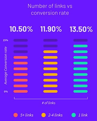
A recommended landing page design practice is to include limited exit opportunities. You may remove the navigation bar of your website, do not include any external or internal links, and avoid using any related offers. The objective of your landing page is to maintain the focus of the visitors on generating conversion and filling the lead-capture form.
8. Generate conversion with a captivating offer
Avoiding exit opportunities will help your website to maintain the focus of the visitors, but captivating them with anything extra can guarantee a high conversion rate.
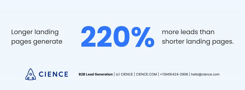
You must offer valuable information, a discount or helpful resource like a free trial or ebook in exchange for the visitor’s email address. The content options available are endless, but you must ensure that the content of the offer must be related to the product or service.
After convincing the customer that the offer is worth it, avoid dissuading them immediately with an unwanted lengthy lead-capture form.
The form must be crisp and short; mostly it contains just the first name, last name and the email address. There can be some extra information too which completely depends upon the goal of your landing page, so make sure that the offer you provide is worth the exchange.
9. Conversion via strong CTA
CTA or call-to-action is the most important part of the landing page. It is the button you landing page visitors will click to submit their personal details after they fill out the lead-capture form.
While you craft the copy of the button, try using words that will inspire and drive the customers to take an action. Most of the time, it is creating some urgency. According to WordStream too, the criteria of a killer CTA is using numbers, strong command verbs and words that will provoke a reason or emotion in the target audience for them to take action.
Keep the CTA design attractive yet simple, the font should be clear, consistent and legible with the other fonts that you have used in the page. However, make the font a bit larger than the descriptive text.
As per several researches, buttons that are rounded in the corners seem to be more clickable than those with sharp corners, but concentrate more on the size than the shape. The CTA should be large so that it stands out on the page in the first look and is easily readable.
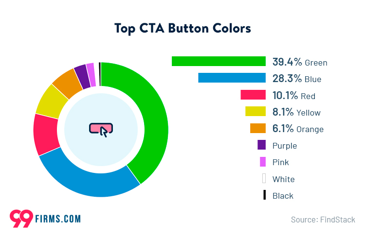
Colour theory plays an important role in marketing. The CTA should make an impact and must also mirror the brand. Experts are of the opinion that contrasting colours are more actionable, for example green and orange. SAP had found years ago that CTAs in orange boosted the conversion rate by 32.5%.
10. The A/B test
After including all the necessary elements in the landing page, you must do the A/B test of the visuals, copy, CTA and design. Review the metrics and performance of individual pages in order to identify what adjustments you need to make to reach the conversion rate. Check one landing page element at a time to see which one made the difference.
It is also important to take note of other elements that you prioritize; decrease the load time of your landing page, especially on mobile devices. The slightest delay in loading time can impact the conversion rate negatively.
Keep track of the landing page
Now that you have gone through the checklist, it is time to analyze the results. These may seem like a lot to keep track of while designing your landing page, but the marketing ROI that you get from these landing pages is worth it.
We hope this article is useful for advertisers and brands. We would love to know your feedback. In case of any comments and queries, you can write to us at Help@TheMediaAnt.com.
